One of the biggest shifts in the digital world recently comes in the area of accessibility.
More and more companies are going out of their way (and rightly so) to cater to those who are unable to interact in the same way as others.
To be honest, my team and I arrived later to this trend than I care to admit, but we are making up for it now and ensuring that websites going forward meet accessibility standards as much as possible.
What is Website Accessibility?
In the web design space, this can simply be defined as creating a user-friendly experience for folks with various visual or motor impairments.
A blind person, for example, will rely on screen readers to be able to access all the objects on the page.
Take images. Images have an “alt text” attribute, which we use to define what an image is for folks using screen readers.
Most do not take the time to fill in this text.
And unless you go out of your way to nullify the alt text (which would result in screen readers skipping the image), it will read the file name for the image, which does not often provide useful information to the reader.
In this case, the alt text should probably read something like “Pictured: a blonde boy sitting next to his golden retriever.”
Do you see how that could drastically improve the user experience for certain website visitors?
Not Just Blind Folks
It is important to help blind people use your website, the reality is that it goes far beyond that!
In fact, you may be surprised just how common visual impairments are, and you may be further surprised to find just how many color combinations are difficult to view.
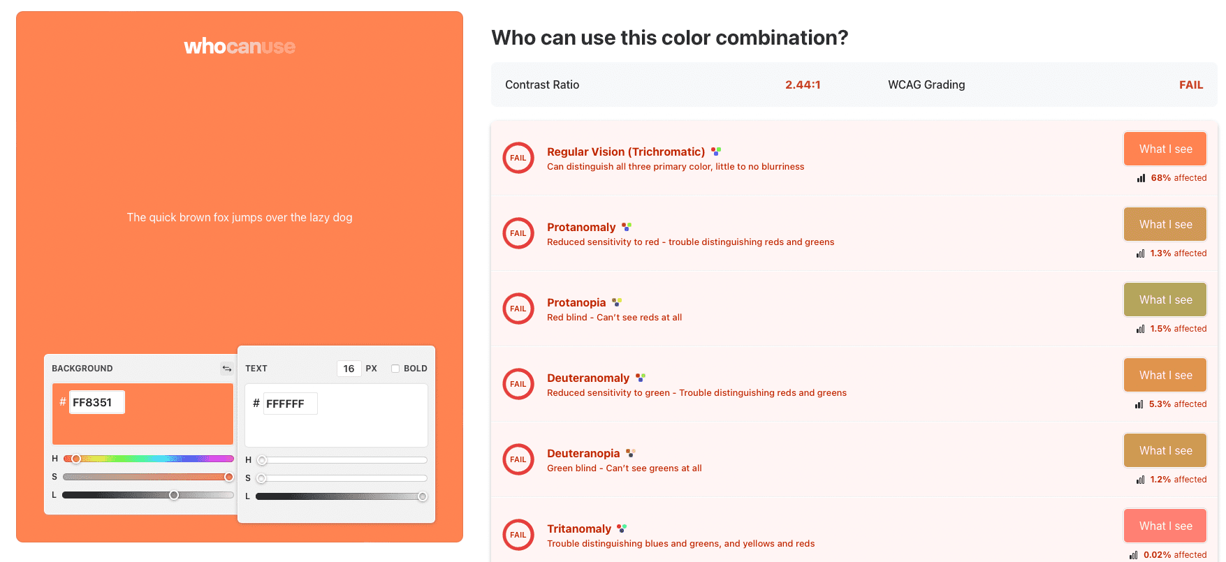
A common combination (which I used to LOVE) for call to action buttons is white on orange. Turns out, it fails literally every accessibility test!

Therefore, when we receive client requests for color choices, we can no longer just implement without consideration for impaired users.
The goal is that as many people as possible be able to use your website.
As I already mentioned, the reason is, it’s the right thing to do! People should just be able to use your website.
But there’s another often overlooked—and very important—reason as well.
Buying Power
Users requiring accessibility accommodations don’t just make up a significant portion of the population, they also represent lots of buying power in the marketplace.
How much? According to Accessly, quite a bit.
According to the latest data from the Centers for Disease Control and Prevention, 61 million adults in the United States live with a disability. Compared to the overall United States adult population, that’s 26%, or about one out of every four adults living with a disability. People with disabilities experience mobility, cognitive, hearing, vision, and other impairments that may impact their ability to access your website and engage with your business. This prevents them from purchasing and being a loyal customer. But do they even try to access the internet? Of course they do. And they have significant spending power…According to a 2018 report from the American Institutes for Research: The total disposable incomes (post-tax) for working-age individuals with disabilities is nearly $500 billion.
The reality is that accessibility is just good business. It’s for these and other reasons that we place a focus on this in the website design process.
Oh Yeah, About Google…
Another thing you probably don’t realize is that search engines are starting and will continue to penalize if your website is inaccessible.
That means on top of losing business from disabled persons, you will begin to lose business from everyone because your website will be returned for fewer results.
To understand why this makes sense, you must understand the goal of search engines. It is always—always!—about user experience.
A search engine is only working properly insofar as it is returning the best result in the most user-friendly environment.
Everything Google and other search engines do is, ultimately, to meet that goal.
It makes sense! If your website cannot be used by significant portions of the population, it does not provide a sound user experience by their definition, and you will be penalized for it.
How We Do Our Part
Accessibility is considered in three critical places when we design a website.
First, the general setup. We use the Divi Theme by Elegant Themes on all of our websites, and we pair a custom coded plugin called Divi Accessibility with it to make sure we are covering the “ground floor” basics.
Second, the design. Then, as we are considering colors and adding images, we use tools like WhoCanUse to ensure we are creating an experience that can be viewed by as many people as possible while staying faithful to our client’s brand.
Finally, the post-launch. We employ a final layer of testing in our post-launch process to make sure, to the extent possible, disabled users can make their way around your website.
Compliance
As mentioned above, Skyview began implementing website accessibility later than we should have.
There is an organization called WCAG that provides compliance standards for accessibility.
We are in the early stages of making our websites accessible, so we do not claim to achieve compliance according to any WCAG standards as of the time of this writing. However, we are aware of those standards and taking steps toward ensuring we choose one and stick to it going forward.
Summary
Website accessibility, though a relatively new practice, is extremely important.
Although we are in the early phases of implementation ourselves, we are doing our part to ensure more and more users can visit and enjoy your website.
As we work through this, we would appreciate two things: Patience and compliance.
Patience because fundamentally changing your long-established web processes is not an easy task. This is an adjustment for us, but we are working through it little by little.
Compliance because it will sometimes be disappointing that we cannot deliver on that exact color combination or placement that you want; we need you to trust that we have your—and your customers—best interests in mind.
Questions about this? Please don’t hesitate to email me personally.


